
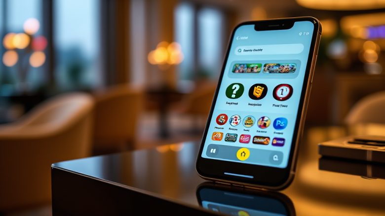
Read Before Reading: How Icons and Colour Carry a Betting Interface
Most of a betting screen is read before a single word is. That claim sounds like a designer’s flourish, but it is testable: open a mobile betting page, blur your eyes, and notice what still communicates. Colour blocks, icon shapes and image weight do the first pass of the work. Text confirms what the eye has already decided. This is a craft review of tk999, a Bangladeshi-facing betting platform, judged on how its visual language carries meaning for users who skim far more than they read.
The audience matters here. Many users arrive on a phone, in a hurry, often in variable light and on variable connections. A design that depends on reading every label is a design that fails half its sessions. The question is not whether the interface looks modern, but whether its icons and colours tell the truth quickly.
Theme one: iconography as a navigation shortcut
The first thing a thumb finds is usually an icon, not a menu word. In a betting context, icons must separate categories that users care about deeply: sports markets, account actions, wallet and payment, and the app download path. When those four are visually distinct, the interface becomes learnable in seconds. When they share a silhouette, the user slows down and starts reading, which is exactly what a skim-first layout is trying to avoid.
The strongest icon systems in this category use one visual metaphor per function and never reuse it. A wallet icon should not double as a promotions icon. A ball should mean sport, not luck. The craft test is simple: cover the labels and ask a new user to guess each destination. If the guesses cluster correctly, the icon set is doing its job.
The caveat: recognition depends on familiarity
Icons are only shortcuts for users who already know the shorthand. A first-time visitor may not recognise a stylised betting slip or a cash-out glyph. That is why the best interfaces pair a strong icon with a short label rather than replacing the label entirely. The icon speeds up returning users; the word rescues newcomers. A design that drops the word to look clean trades comprehension for elegance.
Theme two: colour as a hierarchy signal
Colour is the fastest carrier of meaning on a small screen, and also the easiest to overuse. In a betting interface, colour has to do at least three jobs: separate primary actions from secondary ones, signal state (selected, live, unavailable), and carry brand identity. When one hue tries to do all three, the user cannot tell whether a coloured element is a button, a warning or decoration.
A disciplined palette assigns roles. One accent colour for the main action, a neutral set for structure, and a reserved colour for anything live or time-sensitive. The primary action should be the only element in its colour class on that screen. If two buttons compete in the same hue, the hierarchy has collapsed and the user hesitates, which on a betting screen is a real cost.
The caveat: contrast and context
Colour meaning is not universal. Red reads as urgency in some contexts and as loss in others; green can mean go or money. On a betting platform, where results and balances are emotionally loaded, colour choices need to be tested against the actual data states users see, not just the marketing screens. Low-contrast accent colours also fail outdoors, which is where many mobile sessions actually happen.
Theme three: imagery and the promise it makes
Imagery sets expectation before any copy does. A sports-betting screen that leads with stadium energy promises fast markets and live action. A screen that leads with a calm account dashboard promises control. Both are legitimate, but the image must match the function of the page. When promotional imagery crowds the registration or payment flow, the visual promise and the task diverge, and users feel the friction even if they cannot name it.
For a platform like tk999, the app download path is a good test case. The image beside a download prompt should show a phone in use, not a generic celebration. Functional imagery reduces hesitation; decorative imagery adds noise to a decision the user is already trying to make. The craft question is always whether the picture answers a question the user is asking at that moment.
The caveat: imagery ages fastest
Illustrations and photography date quickly, and a dated image undermines trust in a category where trust is the product. Flat icon sets and neutral device mockups tend to survive redesigns better than stylised human figures. When reviewing a betting interface, check whether the imagery could have been made five years ago; if so, it is probably carrying less meaning than the layout assumes.
Theme four: the registration and payment flow under visual stress
Registration is where visual design is tested hardest, because the user is being asked to do something effortful. Every icon and colour choice either shortens that effort or adds to it. Clear field grouping, a single dominant continue action, and consistent state colours do more for completion than any decorative flourish. This is also where the platform’s overall visual grammar has to hold together, since a user who has learned the icon set on the home screen expects the same logic inside the form.
Payment screens raise the stakes again. Here, colour must signal security and clarity rather than excitement. Muted, consistent styling around wallet and deposit actions reads as competence; loud promotional colour in the same area reads as pressure. The visual lesson is that restraint is a trust signal in high-stakes flows, and the interface should shift register as the user moves from browsing to transacting.
The caveat: consistency beats novelty
A single beautiful screen proves little. The value of an icon and colour system is cumulative, built across home, markets, account and payment views. If each section invents its own visual dialect, the user relearns the interface at every step. Consistency is the quiet craft skill that makes the rest of the design legible.
Frequently asked questions
Why does icon choice matter more on mobile betting screens than on desktop?
Small screens remove context. On desktop, a label, a sidebar and a heading can all clarify a destination at once. On mobile, one icon often stands alone in a tab bar, so its shape has to carry the whole meaning. That is why mobile-first betting interfaces invest heavily in distinct, repeatable icon silhouettes.
Can a strong colour palette compensate for weak labelling?
Only partly. Colour can rank actions and signal state, but it cannot explain what a button does. The reliable pattern is colour for priority, icon for category, and a short word for confirmation. Remove any one of the three and comprehension drops, especially for users encountering the platform for the first time.
What is the quickest visual test for a betting interface?
Blur the screen and see what still reads. If the primary action, the live indicators and the navigation categories remain distinguishable, the visual hierarchy is working. If everything collapses into one coloured mass, the design is relying on text to do work that colour and shape should be doing.